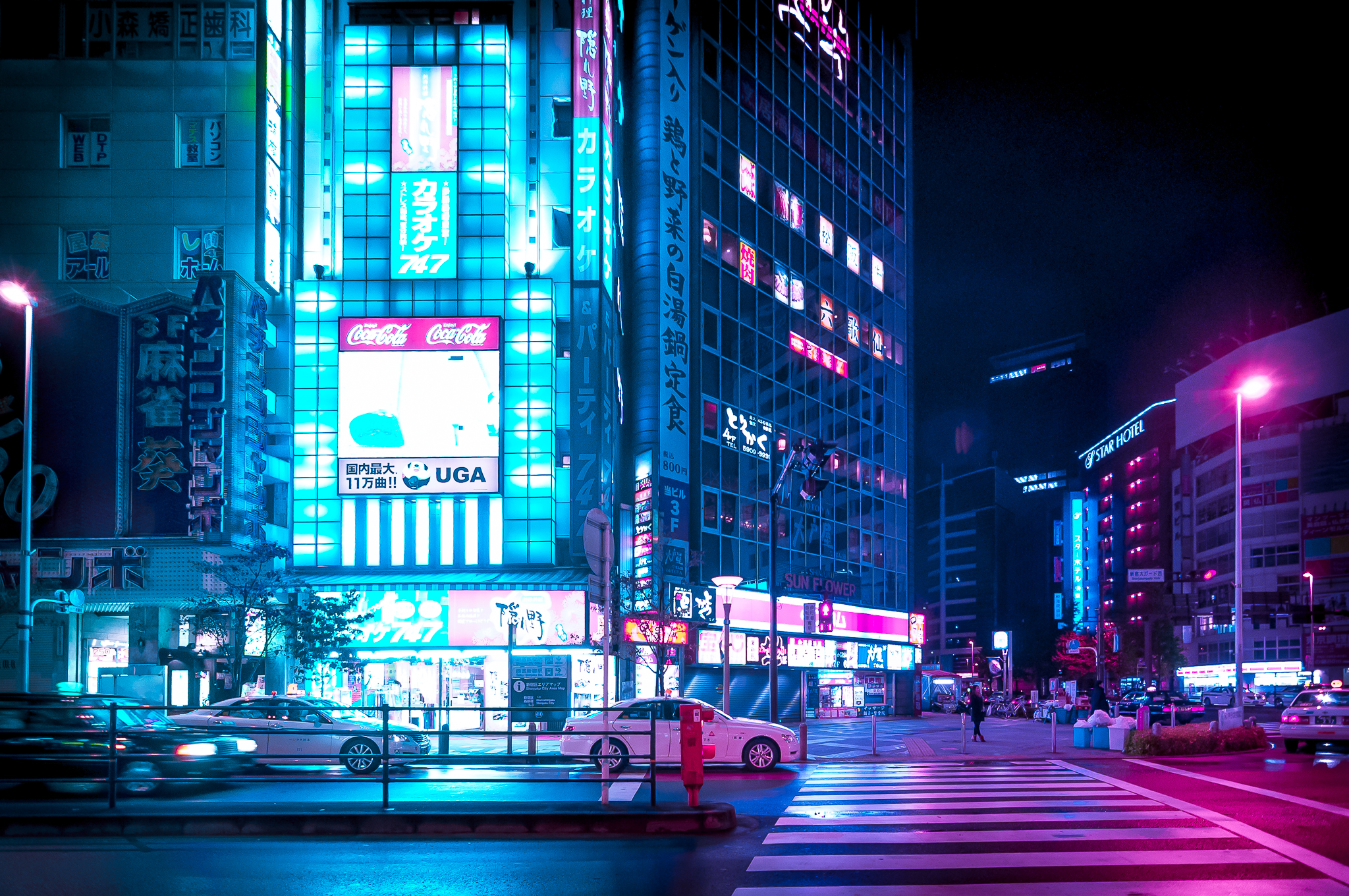
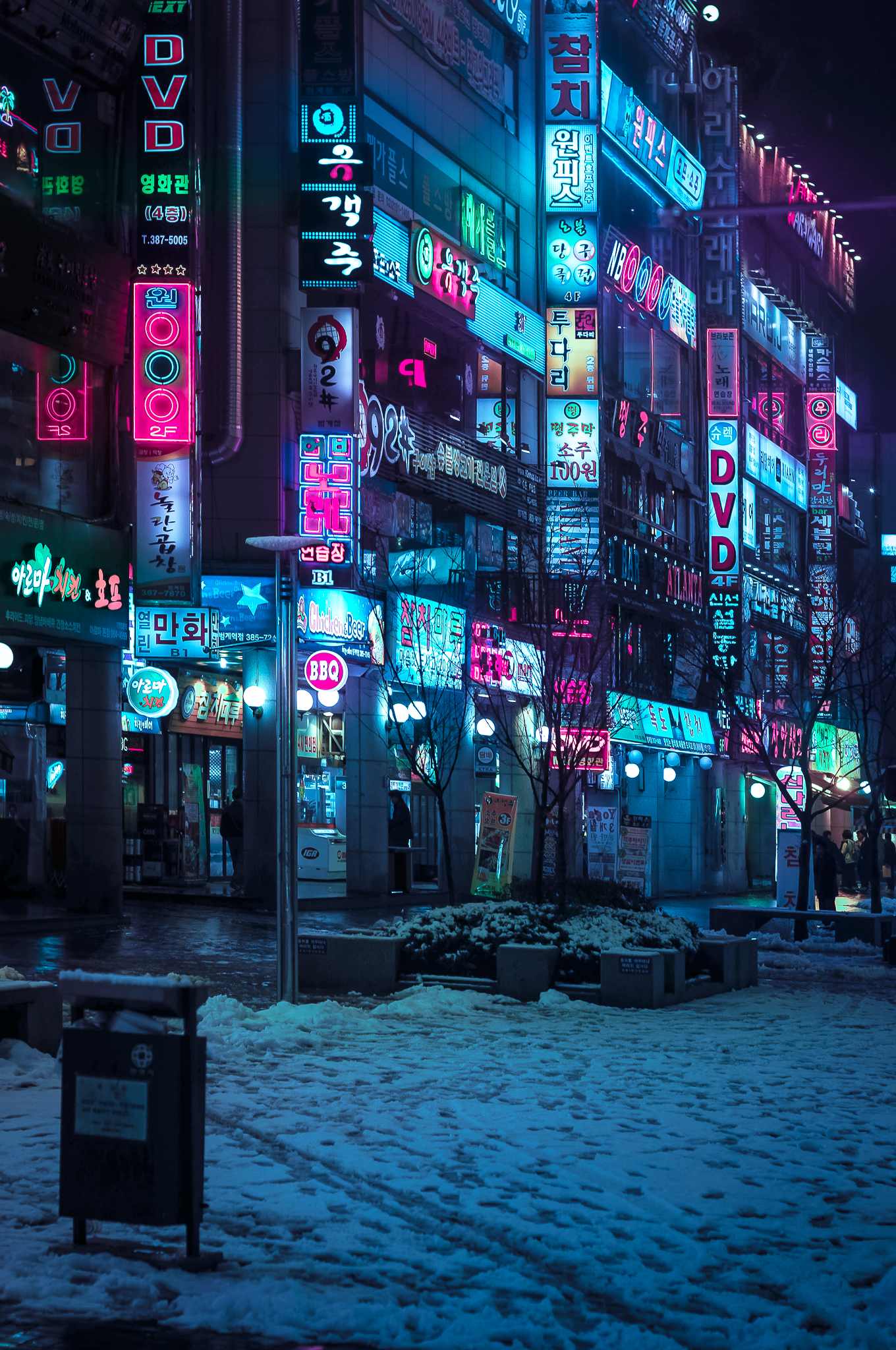
Editing Tokyo night photography is a different problem from editing most other kinds of street work. The issue isn't exposure or focus — it's that the scene contains multiple light sources at wildly different color temperatures and intensities, all competing in the same frame. You've got the deep blue of an LED sign, the orange of a lantern, the pink of a neon tube, and an amber streetlight, all hitting the same patch of wet pavement. The camera records it. The question is whether you edit toward what you saw or what you felt, and how to do that without the image falling apart.
My workflow is in Lightroom. I shoot RAW on the Sony A7R IV, which gives me enough latitude in the shadows to recover a lot. I don't use presets for street work — every Tokyo night frame has too much going on for a one-size preset to handle well. Here's how I approach it.
First Move: Exposure and Shadows Only
I never touch the highlights slider first. In a Tokyo night frame, the highlights are usually neon signs, and they're already at or near clipping in the RAW. Pulling highlights down aggressively makes the signs look dull and grey rather than luminous, which is exactly the quality I want to keep. The signs should glow. Let them.
Instead, I open shadows first — usually +40 to +70 depending on how dark the alleys are. This lifts the street-level detail without touching the bright areas. Then I adjust overall exposure if needed, usually by -0.3 to -0.5 to pull the midtones back into a range that feels like night rather than a well-lit studio. The goal after this step is a frame that has readable shadow detail and signs that still feel lit from within.
White Balance: Don't Fight the Light
This is where most people make Tokyo night photos worse. The temptation is to neutralize the color cast — to push toward a "correct" white balance that doesn't exist in artificial light at midnight. When you do that, you lose exactly the quality that makes the image feel like Tokyo: the layered color, the way different light sources overlap, the pink-orange mix on wet pavement.
I set white balance to approximately 4000–4500K for most Shinjuku and Shibuya frames. This keeps a slight warmth in the dominant light sources without going so warm that the cooler elements (LED signs, blue hour sky remnants) lose their color. If there's a strong blue cast from an LED-heavy scene like Akihabara, I might push slightly cooler, toward 3500K. I make this decision by eye, not by looking at numbers.
Tint (the green-magenta axis) is worth checking. Sodium vapor streetlights push heavily toward green, and a slight magenta adjustment (+5 to +15) brings skin tones back without ruining the street light. Don't over-correct. A mild green cast in a Tokyo street scene is not a problem — it's part of the palette.
Tone Curve: Where the Mood Lives
After the basic panel, I go to the tone curve and add a mild S-curve — shadows pulled slightly down, highlights left mostly alone or pulled very slightly down at the very top. This adds contrast without crushing the shadow recovery I just did, and it's where the image starts to take on the cinematic quality I'm going for. A flat curve produces images that look technically correct but lifeless. The S-curve is where the image starts to feel like a decision was made.
I also use the point curve occasionally to specifically address the deep shadows — placing a control point in the low shadow range and lifting it just slightly, which opens up the darkest parts of an alley without making the overall image feel overly processed. This is subtle. If you can see you've done it, you've gone too far.
HSL: The Color Isolation Tool
The HSL panel is where the specific character of a Tokyo frame gets refined. I use it to do two things: protect the neon colors and manage the orange streetlight.
For neon colors — pinks, reds, cyans — I'll often increase saturation slightly (+10 to +20) and adjust luminance to taste. Neon in RAW files frequently looks less saturated than it appeared to the eye, because the sensor handles near-clipping colors more conservatively than the eye does. A small saturation boost in the reds and magentas restores what was actually there.
For orange streetlights, I'll sometimes pull saturation down slightly in the oranges if a particular lamp is dominating the frame in a way that feels wrong. Not eliminating it — just dialing it back. The orange of an old sodium lamp is part of what makes a Tokyo alley look like a Tokyo alley. I keep it; I just adjust its weight.
Sharpening and Noise
High ISO noise in Tokyo night frames is inevitable and mostly fine. Grain at ISO 6400–12800 on the A7R IV looks like film grain at the sizes I'm posting, which is a feature rather than a problem. I apply standard sharpening (Amount 40, Radius 1.0, Detail 25) and use luminance noise reduction sparingly — usually 20–30, no more. Aggressive noise reduction makes faces look plastic and street textures look like paintings. A little grain is honest.
For images with a specific person as subject, I'll apply local sharpening to the face using a radial filter or brush. The overall image can be slightly soft from the noise reduction; the subject's face should be crisp.
Cropping
I crop more than most photographers admit to. The A7R IV at 61 megapixels gives me room to crop significantly and still have a file large enough for any reasonable output. In street photography, the frame you get is rarely the frame you want — someone cut in at the wrong moment, the background element is slightly off, the subject is a few centimeters too close to the edge. I crop to fix those problems rather than accepting them as the cost of shooting candidly.
I don't crop to standard ratios. If a frame works as a 16:9 panoramic crop, I'll use that. If 1:1 isolates the subject better, I'll use that. The aspect ratio should serve the image, not the other way around.
What I Don't Do
I don't add artificial vignettes. The natural light falloff in Shinjuku alleys or any side street in Tokyo produces a real vignette already — the light source is in the middle of the frame, the edges go dark. Adding a Lightroom vignette on top of that makes the image look manipulated rather than observed. If the frame needs a vignette, the composition probably needed more work in camera.
I don't remove people or objects unless there's a specific reason that goes beyond "it would be cleaner without it." The chaos and visual density of a wet Tokyo street at night is the point. Cleaning it up removes the energy that made you want to take the photograph in the first place.
Want to see what these edits look like on your photos from Tokyo?
Book a Session in Tokyo →